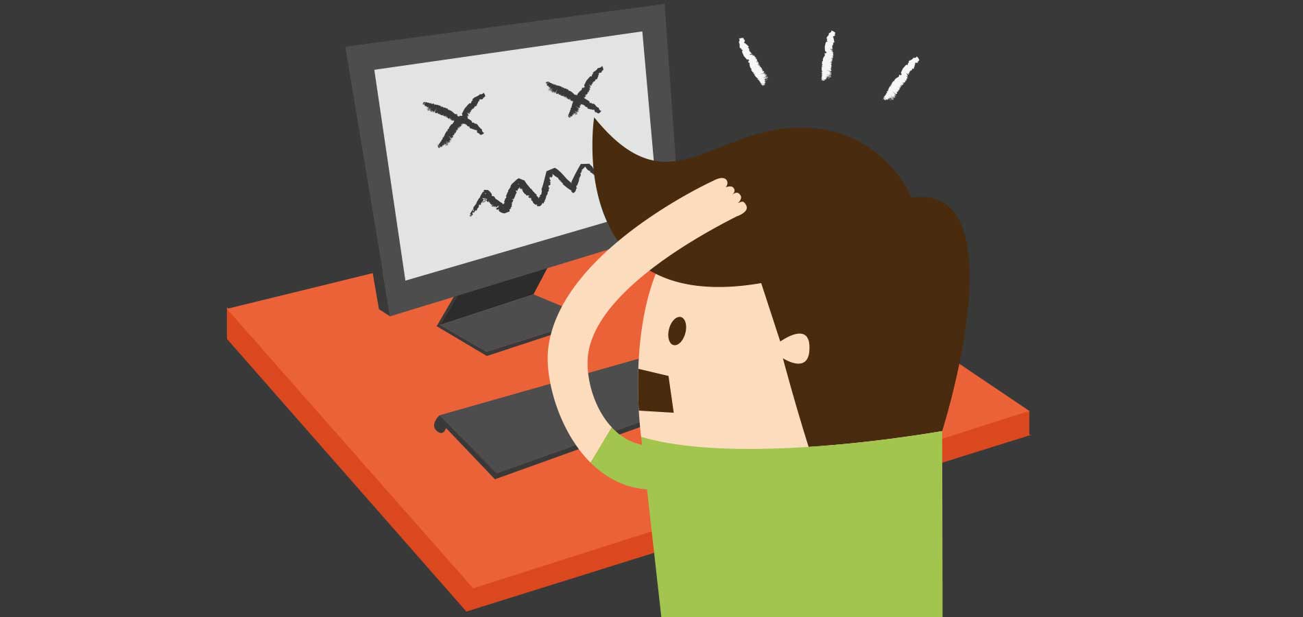
Your website is often the first handshake between your business and a new customer. Making it genuinely easy to use isn't about fancy design — it's about not making people work to find what they came for.
Key takeaways
- User-friendly means people reach their goal quickly and without confusion — not that the site looks impressive.
- Clear, consistent navigation and scannable content do most of the heavy lifting.
- Speed and mobile-friendliness are now baseline expectations, not nice-to-haves.
- Obvious calls-to-action guide people to the next step instead of leaving them guessing.
- Good usability is an ongoing job — test with real people and keep tidying up.
A user-friendly website isn't just about looking good. It's about crafting an experience that feels intuitive — where visitors can find what they need, understand what you offer, and take the next step without a single moment of "hang on, where do I click?" Get that right and people stay longer, trust you more, and are far more likely to get in touch.
Here are nine practical, no-jargon tips for building a site that's genuinely easy to use — whether you're planning a new website or tidying up the one you've got.
What "user-friendly" actually means
Before the specifics, it helps to be clear on what we're aiming for. A user-friendly site lets someone find what they're looking for without frustration or confusion. Behind the scenes that comes down to a handful of things: readability, load times, mobile responsiveness and clear next steps. When those work together, they quietly guide a visitor from the moment they land to the point where they do something — buy, book, sign up or call.
Why does it matter so much? Three reasons stand out:
- People stay. A site that's easy to move around keeps visitors engaged instead of bouncing straight back to Google.
- Fewer people leave early. When someone finds what they need quickly, they're far less likely to give up and go elsewhere.
- More people act. Easy journeys lead to more enquiries and sales, because you're removing the friction between interest and action.
Make navigation effortless
Ever felt lost wandering the aisles of an unfamiliar supermarket? That's exactly how people feel on a site with muddled navigation. Your menu is the map — it needs to be clear, logical and visible. This is one place where being "clever" or unconventional almost always backfires.
Keep it simple and intuitive
A cluttered menu overwhelms people. Group related pages under a few broad, plainly-labelled categories, and use words that tell visitors exactly what they'll find. "Services", "About" and "Contact" beat cute or vague labels every time.
Be consistent
Keep the same menu, in the same place, working the same way, on every page. Visitors shouldn't have to relearn how to get around as they move through your site. Familiarity builds confidence.
Think about internal links and hierarchy
Beyond the main menu, link naturally from one relevant page to another — it helps people go deeper and gives search engines a clearer picture of how your site fits together. A sensible page hierarchy (broad topics up top, detail below) makes the whole thing easier to understand at a glance.
A user-friendly website means people can find what they need without a map and compass. If you catch yourself explaining how to use your own site, that's a sign the navigation needs work.
Write content people can scan
Most people don't read websites word for word — they skim, hunting for the bit that answers their question. Write for that behaviour rather than against it.
- Break it up. Use headings, subheadings, short paragraphs and bullet points so the page is easy to scan. Highlight the genuinely important bits.
- Keep the language plain. Skip the jargon and write like a human. Short sentences, everyday words, no buzzwords.
- Use visuals with purpose. Images, diagrams and the occasional video can break up text and explain things faster than words — but only when they actually add something. Decoration for its own sake just adds clutter.
Design for clarity, not decoration
Good design isn't about cramming in as much as possible — it's about making the important things easy to see and act on.
- Give things room to breathe. White space (the empty area around elements) isn't wasted space. It improves readability and draws the eye to what matters, like your key message or a button.
- Choose colours and fonts carefully. Pick a palette that suits your brand and is easy on the eye, use enough contrast so text is readable, and stick to one or two legible fonts across the whole site.
- Aim for calm, not busy. Every element should earn its place. If it's competing for attention rather than helping, it's probably working against you.
Treat speed as a feature
Speed is one of those invisible parts of user experience — people only notice it when it's bad. And they notice fast: a big chunk of visitors will abandon a page that takes more than a few seconds to load, and slow sites also get marked down by Google. A few things make the biggest difference:
- Optimise your images. Large image files are the number one cause of sluggish pages. Compress them and use modern formats like WebP that keep quality high at a smaller size.
- Cut the clutter under the hood. Every script and element adds a little load time. Trim what you don't need so pages stay lean.
- Use good hosting and caching. Solid hosting, caching and a content delivery network (which serves your site from servers closer to the visitor) all shave off precious seconds.
Design for mobile and accessibility
More than half of web traffic now comes from phones, so "does it work on mobile?" isn't optional — it's where you should start. Design mobile-first: readable text without pinching and zooming, buttons big enough for a thumb, and layouts that adjust smoothly to any screen size.
While you're at it, build with accessibility in mind. That means your site works for people using a keyboard instead of a mouse, plays nicely with screen readers, and uses enough colour contrast to be readable for everyone. It's the right thing to do, it widens your audience, and it happens to be good for SEO too.
Guide people with clear calls-to-action
Once someone's interested, don't make them hunt for the next step. A call-to-action (CTA) is simply the button or link that tells people what to do — "Get a quote", "Book now", "Call us".
- Be clear and direct. Use action words that leave no doubt about what happens next.
- Make them stand out. A contrasting colour and a bit of space around a button help it get noticed, and it should be big enough to tap easily on a phone.
- Put them where they make sense. Place CTAs at the natural moments people are ready to act — at the end of a strong section, next to a service description, or wherever the page has done its convincing.
Test, listen and keep improving
Here's the honest bit: no website is perfectly user-friendly on day one, and it's never really "finished." The most usable sites are the ones that get tweaked based on how real people actually use them.
The simplest test costs nothing — ask someone who doesn't know your business to complete a task on your site and watch where they hesitate. Beyond that, tools like heat maps, simple analytics and the occasional A/B test show you where people click, scroll and give up. Make small adjustments based on what you see, and your site quietly gets better over time.
Creating a user-friendly website doesn't take a magic wand — just a commitment to good habits and a genuine focus on the person on the other side of the screen. Nail navigation, content, design, speed and clear next steps, and you'll have a site that not only looks good but actually does its job.
User-friendly website FAQs
Quick answers to the questions small business owners ask us most about making a website easy to use.
A user-friendly website lets people find what they came for quickly and without confusion. In practice that means clear navigation, scannable content, fast load times, a design that works on mobile, and obvious next steps. If a first-time visitor can reach their goal without having to think about how the site works, it's user-friendly.
There's no magic number, but the old "three-click rule" is a useful sanity check — most key pages should be reachable within a couple of clicks from the homepage. What matters more than the exact count is that each click feels obvious. People don't mind clicking if they're confident they're heading the right way.
People are impatient online. A large share of visitors will leave a page that takes more than a few seconds to load, and slow sites also rank lower on Google. Optimising images, cutting unnecessary scripts and using good hosting all help pages load quickly — which keeps visitors around and improves your search visibility.
The best test is to watch a real person use it. Ask someone unfamiliar with your business to complete a task — find your phone number, book a service, buy a product — and note where they hesitate. Tools like heat maps and simple analytics also show where people click, scroll and drop off, so you can fix the friction.