A website is no longer an online brochure — it's the first real experience someone has of your business. These are the design trends genuinely worth your attention, and how to use them without turning your site into a gimmick.
Key takeaways
- First impressions are formed in a fraction of a second, and a poor experience is enough to send most visitors away for good.
- AI personalisation is the biggest shift — but relevance beats novelty, so use it to be helpful, not to spook people.
- Dark mode, bold minimalism and voice search all reward the same thing: clarity, contrast and content that's easy to scan.
- Immersive touches like AR and 3D can be powerful for the right business, but they're a garnish, not the meal.
- Chasing every trend at once is a mistake — pick the two or three that suit your audience and do them properly.
Web design moves in fashions, the same way clothes do. What looked sharp five years ago can quietly start to age a business, and most owners don't notice until a customer mentions the site is a bit clunky on their phone. The good news is you don't need to be a designer or a developer to keep up. You need a clear idea of who your site is for, and a sense of which trends actually help them.
So let's skip the hype and walk through the ones that earn their place — what they are, why they work, and how to use each one without overdoing it.
Why design trends matter (a little)
Here's the uncomfortable truth: people judge your website almost instantly. Studies have long put that first impression at a fraction of a second — faster than a conscious thought. And once a visitor has a bad experience, most won't come back. Your site is quietly either building trust or leaking it.
That's why trends are worth a look — not because you should chase them, but because the good ones are usually solving a real problem: making a site faster, clearer, easier to use or more welcoming. Design today is less about decoration and more about function, accessibility and a smooth experience. Keep that lens on and you'll spot the difference between a trend worth adopting and one that's just noise.
AI-powered personalisation: make it about the visitor
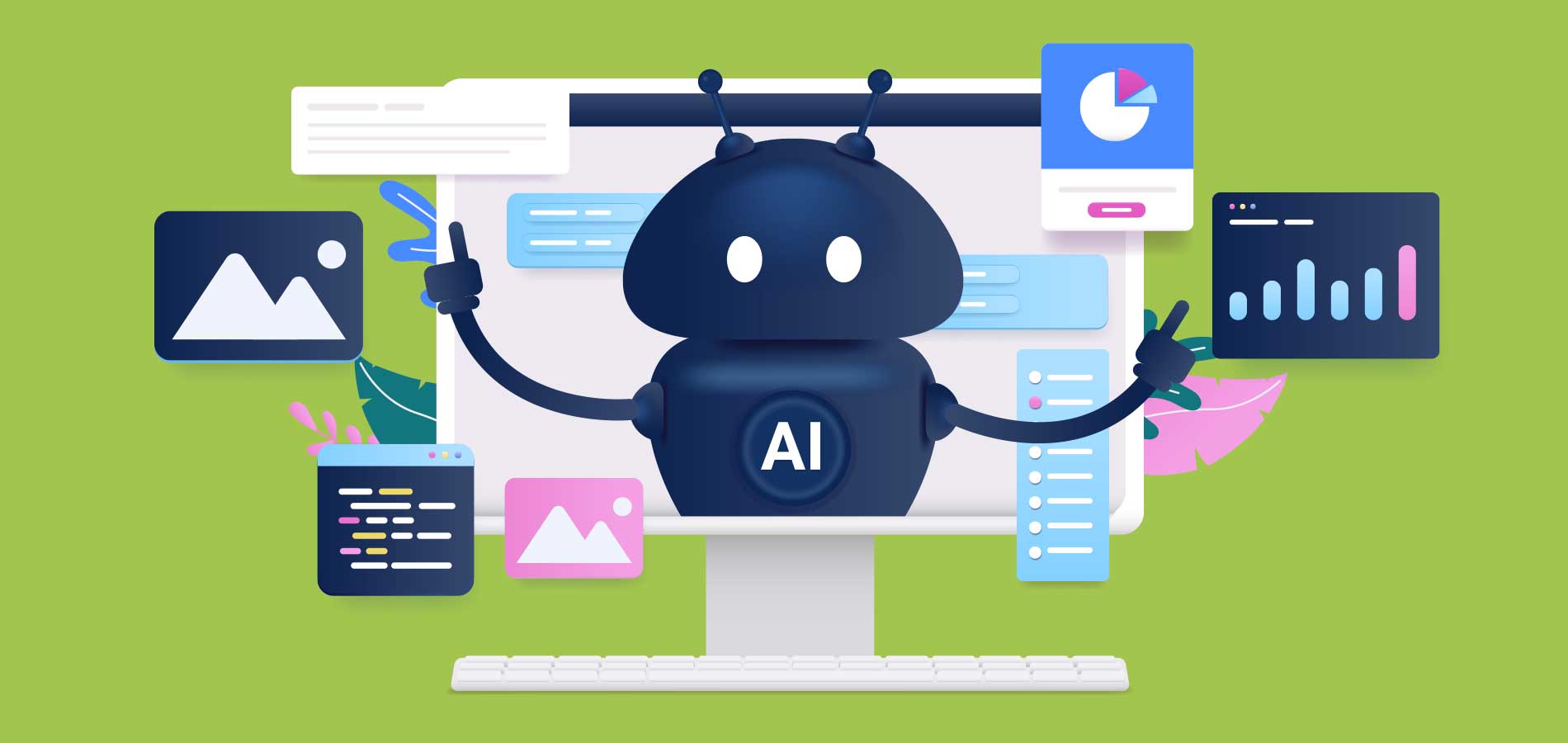
If there's one shift reshaping web design, it's AI-driven personalisation. Sites are getting smarter about tailoring what they show — content, product suggestions, even layout — based on how someone actually behaves. Picture landing on a shop and seeing the sort of thing you'd genuinely consider buying, rather than a wall of everything. Handled well, it feels helpful. Handled badly, it feels like being followed around, so the line to walk is relevance, not surveillance.
You don't need a data-science team to get started. A few practical moves:
- Use a well-set-up chatbot or assistant to answer common questions around the clock — as long as it sounds human and knows when to hand over to a person.
- Add predictive or smart search so people find things quickly instead of hunting through menus.
- Surface relevant next steps — a related service, a helpful guide — rather than making every visitor start from scratch.
The test for any AI feature is simple: does it make the visitor's life easier? If the honest answer is "not really, but it looks clever," leave it out.
Dark mode, done thoughtfully
Dark mode has gone from novelty to normal. It's easier on the eyes in low light, and it saves battery on the OLED screens most phones now use. But a dark theme is more than dropping a black background behind your existing site.
Done properly, it needs the same care as any other design decision:
- Use genuinely readable contrast. Faint grey text on near-black is a strain — crisp, legible type wins.
- Let accents do the work. A well-placed pop of colour reads beautifully against a dark backdrop.
- Where you can, give people the choice to switch between light and dark. Respecting their preference is the whole point.
Bold minimalism: do more with less
Minimalism is still going strong, but it's shed the cold, empty feeling it used to have. The current flavour is bold minimalism — clean, uncluttered layouts with confident typography, generous space and the occasional strong colour or oversized element to give it personality.
The idea is to strip away the clutter so your actual message has room to land. A few ways to get there:
- Pick one or two strong fonts and use them consistently across the whole site.
- Keep navigation short and obvious — nobody wants to dig through a dozen dropdowns to find your contact page.
- Use motion sparingly. A subtle hover effect adds polish; animation on everything just gets in the way.
Designing for voice search
More people are talking to their devices — asking Siri, Alexa or Google for the nearest café or the best local plumber. Voice search has grown into a genuine slice of how people find businesses, and it changes the kind of language your site needs to use.
Voice queries are conversational and question-shaped, so your content should be too:
- Answer real questions in plain language — the sort of thing someone would actually say out loud.
- Structure content so answers are easy to lift: clear headings, short paragraphs, FAQs and lists.
- Keep pages fast. Voice searchers want an instant answer, and speed feeds into your rankings anyway.
Immersive AR & VR touches
Augmented and virtual reality have moved well beyond gaming. Real estate sites offer 360-degree walk-throughs, retailers let you "try on" a pair of glasses through your camera, and interactive 3D can bring a product to life in a way flat photos never could.
The honest caveat: this is powerful for some businesses and pointless for others. If it genuinely helps someone make a decision, it's worth it. A few starting points:
- Add a virtual tour or 3D view if you sell spaces, property or physical products people want to inspect.
- Consider a simple "try before you buy" feature for e-commerce where fit or look matters.
- Treat it as a garnish, not the meal — the fundamentals of speed, clarity and content still come first.
Quick wins for an instant refresh
Short on time? You don't need a full rebuild to feel more current. A handful of small fixes make an outsized difference:
- Compress your images so pages load quickly — nobody waits around for a slow homepage.
- Add subtle micro-animations, like a gentle hover state, to give the site a bit of life.
- Rewrite your copy the way you'd actually speak. Warm and clear beats corporate every time.
- Simplify your navigation so the important things are easy to find.
- Open your site on a phone and fix anything that's fiddly. That's how most people will see it.
Trends will keep shifting, but the thing underneath them doesn't: put yourself in the visitor's shoes. If your site is easy, clear and genuinely useful for them, you're already ahead of most of the web.
Web design trend FAQs
The questions small business owners ask us most when they're weighing up a refresh.
AI-powered personalisation is the standout — websites using data to tailor content, recommendations and search to each visitor. Used well, it makes a site feel helpful rather than generic. Used badly, it feels creepy, so the goal is relevance, not surveillance.
It depends on your time and the complexity of what you need. Platforms like Squarespace and Webflow let you build a decent site without code. For custom features, better SEO or a site that's a real sales tool, a professional designer usually saves you time and pays off over the life of the site.
It's non-negotiable. More than half of all web traffic now comes from phones, and Google ranks the mobile version of your site first. If your site is awkward to use on a small screen, most visitors will simply leave.
Accessible design means everyone can use your site, including people with disabilities. Practical steps like alt text on images, proper heading structure, good colour contrast and keyboard navigation widen your audience, improve SEO and are increasingly a legal expectation.
Keep it clean, be clear about who you are and what you do, and prioritise the visitor's experience over showing off. A fast, easy-to-use site with a genuine personality and one or two well-chosen interactive touches will always beat a cluttered one crammed with every trend at once.