Is your website feeling a little... outdated? Much like fashion, web design trends come and go. What was chic and cutting-edge five years ago might now be as out of place as shoulder pads from the ‘80s. Whether you’re a business on the bustling Gold Coast or a freelancer working from a beachside café, keeping your website fresh and user-friendly is crucial. So, how do you know it’s time to give your digital presence a facelift? Here are five telltale signs it’s time for a website redesign.

1. Your Website Isn’t Mobile-Friendly
The Sign: In an era where smartphones are practically glued to our hands, having a mobile-friendly website isn’t just a luxury—it’s a necessity. If users have to pinch, zoom, and scroll horizontally just to read your content, you’re likely losing visitors faster than you can say "bounce rate." Google’s algorithm also prioritizes mobile-friendly sites, meaning your search rankings could be suffering.
The Benefit: A responsive web design ensures your site looks great and functions well on any device, from desktops to tablets to smartphones. This not only improves user experience but also enhances your SEO performance, leading to higher search engine rankings and increased traffic.

2. High Bounce Rates and Low Conversion Rates
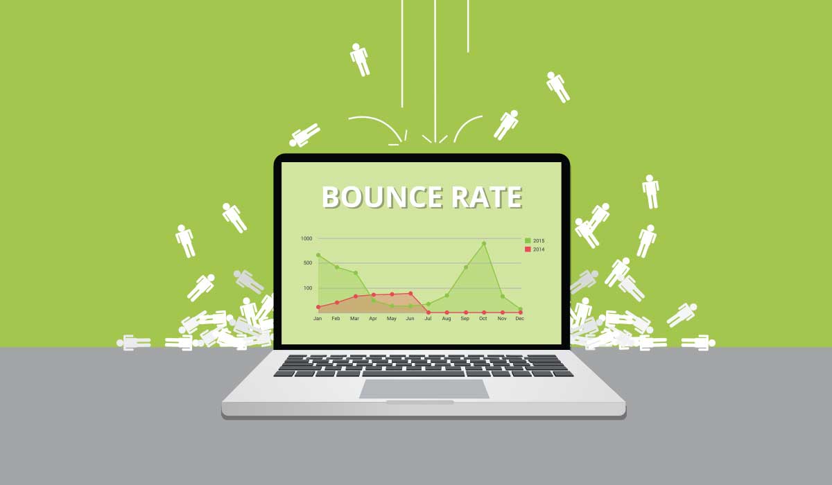
The Sign: Analyzing your website’s performance metrics can reveal a lot about its health. High bounce rates indicate that visitors are leaving your site almost as soon as they arrive. Low conversion rates mean that visitors aren’t taking desired actions, such as making a purchase, filling out a contact form, or signing up for a newsletter. These issues often stem from poor design, slow loading times, or confusing navigation.
The Benefit: A redesign that focuses on user experience can drastically improve engagement and conversion rates. Simplifying navigation, speeding up load times, and creating a visually appealing design can keep visitors on your site longer and encourage them to take action, ultimately boosting your business outcomes.

3. Outdated Visuals and Functionality
The Sign: Web design trends evolve, and what looked sleek and modern five years ago might now appear tired and outdated. If your site still relies on Flash animations or has a cluttered layout with tiny fonts, it’s definitely time for a refresh.
The Benefit: Modern web design favours clean lines, plenty of white space, and large, readable fonts. Additionally, updated functionality like integrated social media buttons, easy-to-use contact forms, and fast-loading pages are now standard. A contemporary, professional look can help establish trust and credibility with your audience, particularly in the competitive Gold Coast market.

4. Poor SEO Performance
The Sign: Search Engine Optimisation (SEO) is the backbone of any successful online presence. If your website isn’t showing up on the first page of search engine results, you’re missing out on potential traffic. An outdated web design might not be optimized for SEO best practices.
The Benefit: A redesign that incorporates current SEO strategies can significantly boost your visibility and drive more organic traffic to your site. This includes having a mobile-friendly design, fast loading times, proper use of header tags, and optimized images and content. Improved SEO can lead to higher search engine rankings, bringing more potential customers to your website.

5. Your Business Has Evolved
The Sign: Businesses grow and evolve, and your website should reflect these changes. If your site no longer represents your brand’s voice, products, or services accurately, it’s time for an update.
The Benefit: A redesign can help you realign your online presence with your current business goals and ensure consistency across all channels. Whether you’ve expanded your offerings, rebranded, or shifted your target market, an updated website can effectively communicate your brand’s evolution and attract your desired audience.
The Gold Coast Factor
Living and working on the Gold Coast has its unique benefits and challenges. The vibrant, competitive business environment here means standing out is essential. Your web design needs to not only capture the laid-back yet dynamic spirit of the Gold Coast but also cater to a diverse audience. Whether you’re targeting other local businesses, international tourists, or local consumers your website should be as appealing and accessible as possible.
And That’s a Wrap
Recognising the signs that it’s time for a website redesign is crucial for maintaining a strong online presence. If your site is not mobile-friendly, has high bounce rates, looks outdated, performs poorly in SEO, or no longer reflects your business, it’s time to consider a makeover. A well-designed website can enhance user experience, improve search engine rankings, and ultimately drive business growth. For businesses on the Gold Coast, staying current with web design trends is particularly important to stand out in a vibrant, competitive market.
Remember, your website is often the first interaction potential customers have with your brand. Make it count with a design that’s modern, functional, and reflective of your business’s unique personality. So, if you’re seeing any of these signs, don’t delay—start planning your website redesign today. Your future customers will thank you!
By ensuring your website is always up-to-date and user-friendly, you can keep your online presence strong and continue to attract and retain customers. Whether you’re a local business or catering to a global audience, investing in quality web design on the Gold Coast can make all the difference.


