Web design moves fast, and 2023 leaned hard into immersive, memorable experiences — with a big dose of nostalgia thrown in. Here's a run-through of the trends that defined the year, and an honest look at which ones have held up and which were passing fads.
Key takeaways
- 2023's headline trends centred on nostalgia, depth and playfulness — Y2K looks, 3D, glassmorphism and just-for-fun interactions.
- Some, like custom typography and social proof, have aged well and remain worth using.
- Bolder aesthetics like the full Y2K look are best used in small doses, since heavy styling dates quickly.
- The most valuable "trend" isn't a look at all — it's a fast, lightweight, mobile-friendly site.
- Trends are worth watching, not chasing; use them only where they help the people visiting your site.
2023 in context
Back in 2023 the emphasis was firmly on creating immersive, unforgettable experiences — websites that felt like a place to be, not just a page to read. There was talk of the metaverse and Web3 spilling into design, alongside a strong pull toward nostalgia. Looking back with the benefit of hindsight, some of these ideas have become staples and others have quietly faded. That's the nature of trends: worth watching for fresh ideas, but never worth chasing at the expense of a site that actually works.
The Y2K revival
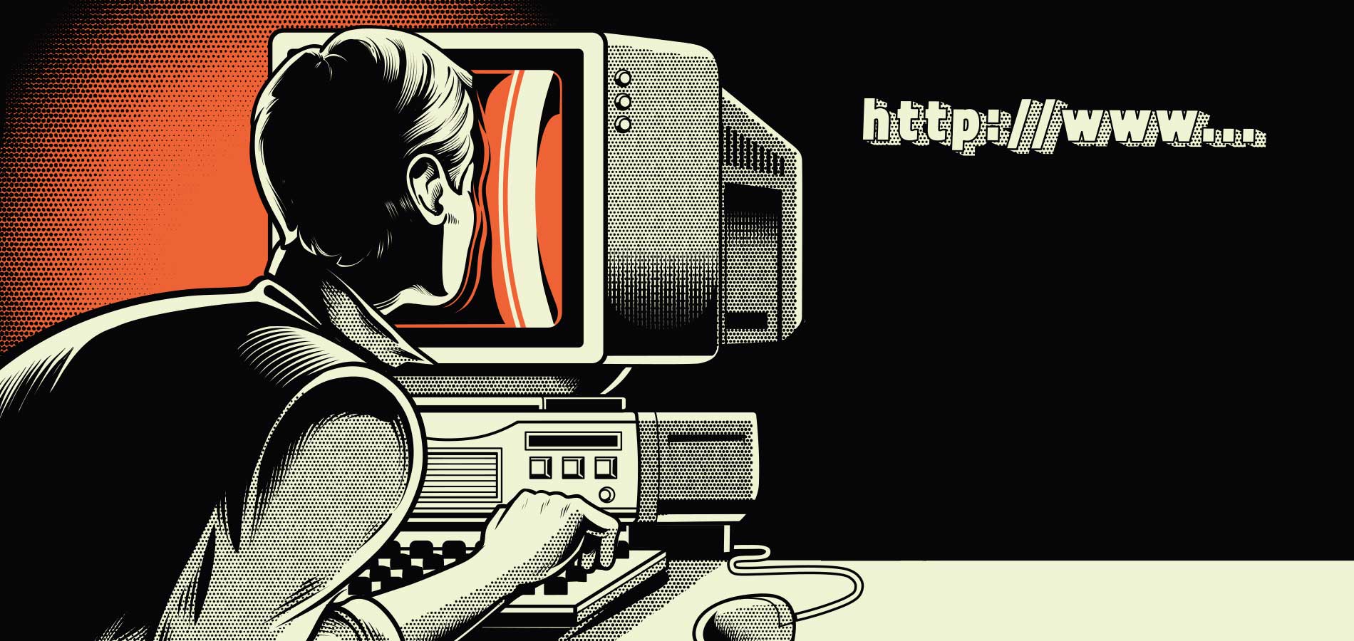
If you noticed the early-2000s aesthetic creeping back into fashion, music and interiors, web design followed. Retro-futurism, vaporwave and "cybercore" brought supersized custom cursors, retro typefaces and deliberately pixelated images. Social media and the pace of online culture have shortened the old nostalgia cycle dramatically, so looks come back around faster than they used to.
Did it stick? In pockets, yes — especially for brands targeting younger audiences. But the full Y2K treatment dates quickly, so the smart move has always been to borrow a touch of it rather than commit your whole site to a look you might regret in a couple of years.
Custom typography
Generic system fonts gave way to custom, hand-designed lettering — a reliable way to make a distinctive first impression. With no single dominant style, designers had real freedom, using font tools or illustration software to craft lettering that's as much a graphic as it is text.
Did it stick? Very much so. Distinctive, well-chosen type is one of the most durable ways to stand out, as long as one rule holds: it has to stay easy to read. Striking but illegible type helps nobody.
Depth: 3D, claymorphism and glassmorphism
2023 pushed hard past flat 2D design. Three big looks led the way:
- 3D illustration — multi-layered graphics and full-page effects that pull visitors into a scene.
- Claymorphism — soft, rounded, cartoonish shapes (think Wallace and Gromit) that feel tactile and friendly, and are great at creating an emotional connection.
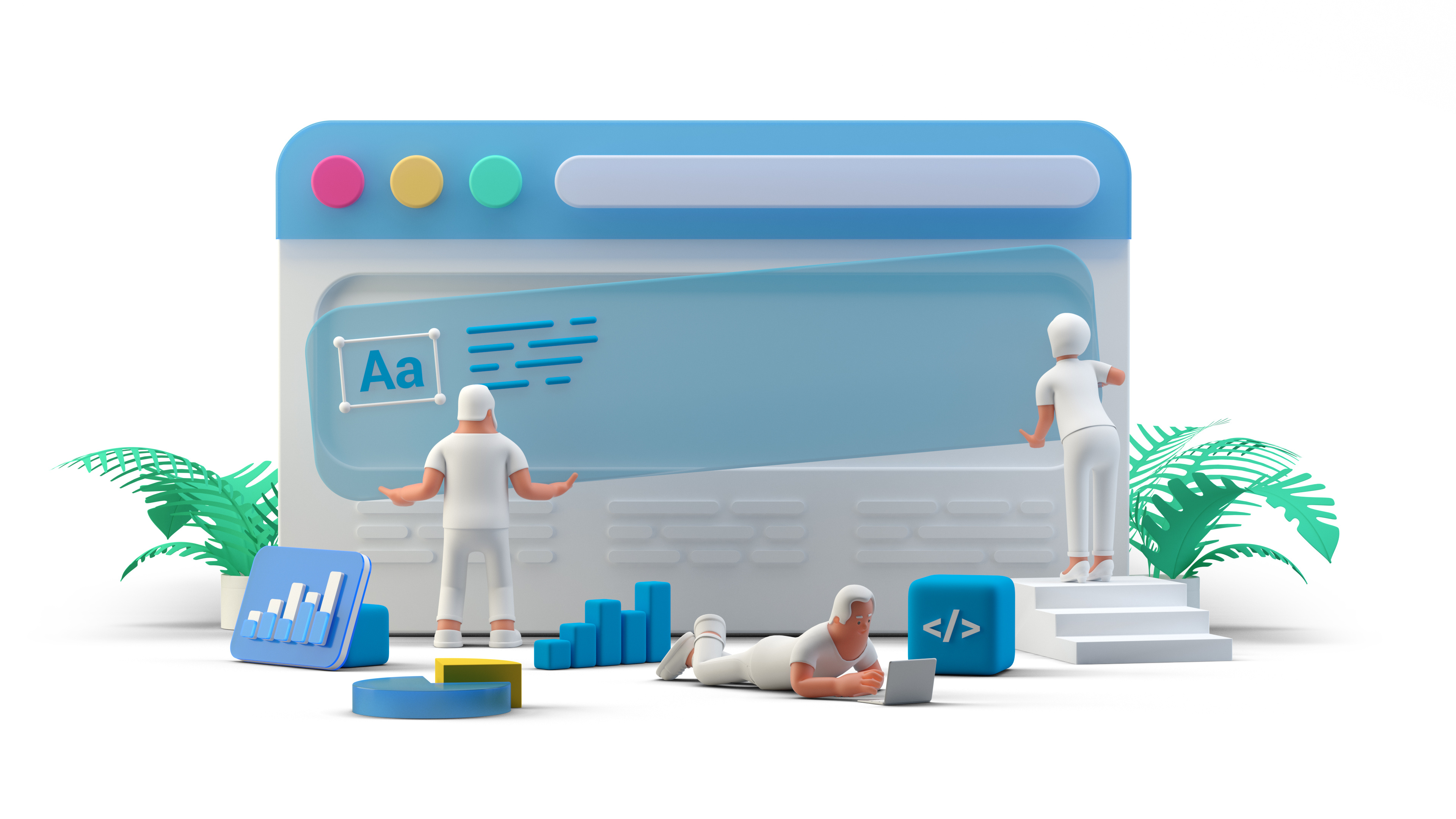
- Glassmorphism — frosted-glass panels with transparency and blur that create a sleek sense of depth. It works best layered over vibrant backgrounds and colourful shapes, and is handy for drawing the eye to a specific element.
Did it stick? Depth and texture are still going strong, though tastefully — used to guide attention rather than overwhelm. The main caution is performance: heavy 3D and effects can slow a page down, so they need to be used with a light touch.
Almost every trend on this list comes with the same footnote: it's only worth it if it doesn't slow your site down. A striking effect that adds two seconds to your load time usually costs you more visitors than it wins.
Playful interactions & loading animations
Not everything on a page needs a job. 2023 embraced "just for fun" interactions — a button that showers hearts down the screen, a playful ball-pit effect — small moments of delight that make a site memorable. The trick is placement: keep them where they add charm without getting in the way of actually using the site.
Loading animations made a comeback in the same spirit. Once a practical necessity, then unfashionable, they returned as a branding opportunity — a chance to reinforce who you are while a page loads, and to make any waiting feel less tedious.
Did it stick? Micro-interactions and thoughtful little animations have become a lasting part of good design. The playful extremes come and go, but small, purposeful touches endure.
Social proof
Social proof is the idea that people trust something more when they can see others have had a good experience with it. Reviews, ratings, testimonials, and social shares all reassure a visitor that you're credible and worth their time.
Did it stick? This one isn't so much a trend as a permanent fixture. Reviews and testimonials build trust, help win sales, and can even support your SEO — genuinely a win-win, and one of the easiest wins on this whole list for a small business.
The evergreen trends that never date
Some things get called trends but are really just good practice that never goes out of style:
- Lightweight, fast websites. A flashy site should never come at the cost of speed. Mobile users often browse on patchy connections, and the lighter your page, the less likely they are to give up and leave. If someone visiting the Gold Coast can't load your menu quickly, they'll simply find a competitor who loads faster.
- Premium and gated content. The rise of subscriptions and paid memberships showed that people value good content enough to pay for it. Offering premium or members-only material can open a new revenue stream and signal that what you provide has real value.
If you take one thing from this list, make it that last idea. Looks will keep changing, but a quick, clean, easy-to-use website is always in fashion. Chase the trends that make your site clearer and more welcoming, skip the ones that just add weight, and you'll stay current without constantly starting over.
Web design trends FAQs
Common questions about following design trends without letting them run your website.
Trends are worth watching, not chasing. They can keep your site feeling current and give you fresh ideas, but a trend that gets in the way of loading speed, readability or ease of use isn't worth it. Use trends selectively, in service of the people visiting your site.
The Y2K and retro-futurist look had a strong run and still shows up, especially for brands aimed at younger audiences. Like all bold aesthetics, it suits some brands and not others. The safest approach is to borrow small touches rather than commit your whole site to a look that may date.
They can if you overdo it. Heavy animations, large images and complex effects can slow a page down, which frustrates visitors and works against you in search. A good rule is to add visual flair only where it doesn't compromise how fast and smoothly the site loads.
Pick and choose. A small business rarely needs to adopt a whole trend to benefit from it — a touch of playful interaction, some social proof or cleaner typography can freshen a site without a full redesign. Focus on the trends that make your site clearer and more trustworthy.
A fast, lightweight, mobile-friendly website. Fashions in look and feel come and go, but a site that loads quickly and works smoothly on any device is always in style — and it's the single thing most likely to keep visitors from leaving.