
14 March 2021
Web Design
In today's digital landscape, your website is often the first point of contact between your brand and potential customers. The usability of your website can make or break the user's experience, ultimately influencing their decision to engage with your business or look elsewhere. Creating a user-friendly website isn't just about aesthetics; it's about crafting an intuitive and satisfying experience for your visitors.
In this article, we'll discuss some simple yet effective tips for designing a website that is easy to navigate and encourages users to stay longer and interact more.
Understanding User-Friendly Design
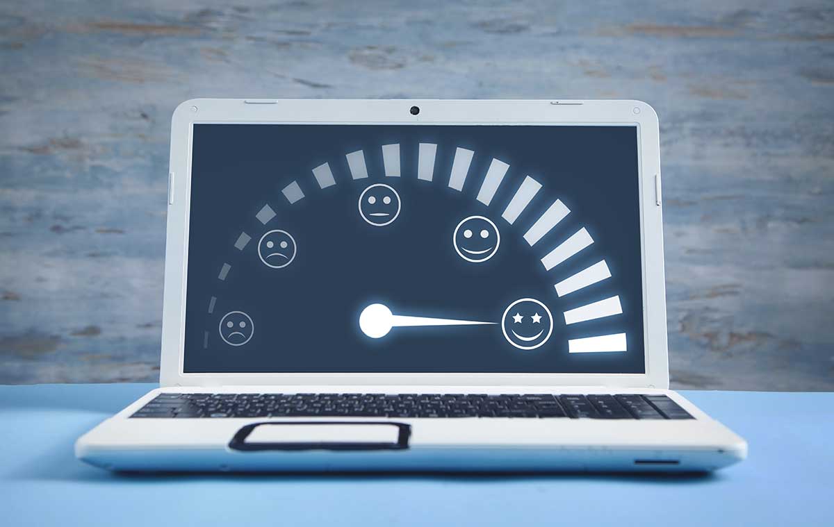
Before diving into specific design tips, it's important to understand what makes a website user-friendly. An easy-to-navigate web design ensures that users can find what they're looking for without frustration or confusion. It takes into account factors such as readability, load times, mobile responsiveness, and clear calls-to-action. An effective website design seamlessly guides the user through a journey from the moment they land on your site to the point where they complete a desired action, whether it's making a purchase, signing up for a newsletter, or contacting your business.
Here are some key reasons why easy navigation is essential:
- User Retention: A site that's easy to navigate keeps users engaged. They're more likely to stay and explore.
- Lower Bounce Rates: If users can find what they need quickly, they're less likely to leave your site prematurely.
- Higher Conversions: Easy navigation can lead to more conversions. When users can find what they need, they're more likely to take action.
In the next sections, we'll delve into how to achieve quick access and easy navigation on your website.
Quick Access: The Path to User Satisfaction
Quick access to information is a key factor in user satisfaction. When users visit your site, they have a goal in mind. They want to find information, make a purchase, or perform some other action.
If they can't achieve their goal quickly and easily, they'll get frustrated. This can lead to higher bounce rates and lower conversions.
By ensuring quick access to information, you can keep users engaged, reduce bounce rates, and increase conversions.

Navigation: The Backbone of User Experience
Ever been lost in a maze of aisles in a supermarket? That’s how users feel about poor website navigation. Your site should have a clear, logical navigation structure with a visible menu. Stick to a standard layout where possible — creativity here often leads to confusion and follow the below web design tips.
Keep It Simple and Intuitive
The key to effective website navigation is simplicity. A complex or cluttered navigation menu can overwhelm users and make it difficult for them to find what they need. Stick to a clean, well-organized layout that groups related pages under broader categories. Use descriptive labels that clearly indicate what users can expect to find on each page.
Consistency Is Key
Maintain consistent navigation throughout your site. This means using the same style, placement, and functionality for your menu on every page. Users should not have to relearn how to navigate your site as they move from one section to another. Consistency helps build familiarity and confidence as users interact with your site.
Prioritize Accessibility
Ensure your website navigation is accessible to all users, including those with disabilities. This includes providing keyboard navigation for users who cannot use a mouse and ensuring your site is compatible with screen readers.
Remember, a user-friendly website means users can find what they need without a map and compass.

Content: The Heart of Your Website
Make Content Scannable
Internet users tend to skim through content to find the information they need quickly. Break up text with headings, subheadings, bullet points, and numbered lists to make your content easier to scan. Highlight important information with bold or italicized text to draw attention to key points.
Use Clear and Concise Language
Avoid jargon and overly complex language. Write in plain English to ensure that your content is easily understood by a wide audience. Keep your sentences and paragraphs short to enhance readability.
Incorporate Visuals Wisely
Visual elements like images, videos, and infographics can enhance user engagement and break up large blocks of text. However, use them judiciously to avoid clutter and distraction. Ensure that all visuals serve a purpose and contribute to the overall message of the page.
Design: More Than Just Looks
Embrace White Space
White space, or negative space, is the empty area around design elements. It's not wasted space; rather, it helps to create a clean and uncluttered look. White space can improve readability and focus attention on important content or calls-to-action.
Choose Colours and Fonts Carefully
Colour and typography are powerful tools in web design. Choose a colour palette that reflects your brand and is pleasing to the eye. Use colour contrasts to make the text stand out against the background. Select fonts that are easy to read and use them consistently across your site.
Design for Mobile
With more users accessing the web from mobile devices, mobile responsiveness is non-negotiable. Design your site with a mobile-first approach to ensure that it looks and functions well on all screen sizes. This includes touch-friendly elements, readable text without zooming, and quick load times.
Performance and Speed: The Invisible Aspects of User Experience
Optimize Images and Media
Large image and media files can slow down your site, leading to a poor user experience. Optimize your visuals for the web by compressing them without sacrificing quality. Consider using newer image formats like WebP that offer better compression and quality than traditional formats.
Minimize HTTP Requests
Each element on your page, from scripts to images, requires a separate HTTP request to the server. Too many requests can slow down your site. Minimize the number of elements on each page and use CSS sprites to combine multiple images into one.
Use Caching and Content Delivery Networks (CDNs)
Caching stores copies of files so that they can be delivered to users more quickly. A CDN distributes your content across multiple servers around the world, reducing the distance it has to travel to reach the user. Both can significantly improve your website's performance.
Calls-to-Action: Guiding Users to the Next Step
Be Clear and Direct
Your calls-to-action (CTAs) should tell users exactly what you want them to do next. Use action-oriented language like "Buy Now," "Sign Up," or "Learn More" to prompt users to take action.
Make CTAs Stand Out
Design your CTA buttons to be easily noticeable. Use contrasting colors and ample white space around them to make them pop. Ensure that they're large enough to be clicked easily, especially on mobile devices.
Place CTAs Strategically
Think about the user's journey through your site and place CTAs at points where they are most likely to take action. This could be at the end of a compelling piece of content, alongside a product description, or within a blog post that relates to your service.

SEO-Friendly Navigation and User Engagement
SEO-friendly navigation is crucial for your site's visibility. Search engines favour sites that are easy to navigate. This includes clear, descriptive link texts and a logical page hierarchy.
On the other hand, user engagement is directly linked to navigation. Users are more likely to engage with your site if they can easily find what they want.
So, a well-structured, SEO-friendly navigation can boost both your search rankings and user engagement.
Utilizing Menus and Links Effectively
Menus and links are the backbone of your site's navigation. They guide users through your content and help them find what they need.
However, it's important to use them effectively. Too many links can overwhelm users, while too few can leave them lost.
Dropdown, Sidebar, and Mega Menus
Dropdown, sidebar, and mega menus are popular navigation options.
- Dropdown menus save space and keep your site uncluttered.
- Sidebar menus provide quick access to different sections.
- Mega menus are useful for sites with a lot of content.
Internal Linking and Page Hierarchy
Internal linking is a powerful tool for navigation. It guides users to related content and improves SEO.
Page hierarchy, on the other hand, helps users understand your site's structure.
A clear hierarchy makes your site easier to navigate and more user-friendly.
Testing and Feedback: Continuous Improvement
User-friendly web design is not a one-time task; it's an ongoing process. Regular testing and user feedback are essential to identifying areas for improvement. Use tools like heat maps, A/B testing, and user surveys to gather insights into how people are interacting with your site. Make adjustments based on this data to enhance the user experience continually.
Conclusion
Creating a user-friendly website doesn’t require a magic wand, just a commitment to good design practices and a focus on user experience.
By focusing on navigation, content, design, performance, and clear calls-to-action, you can build a website that not only looks good but also provides a seamless and enjoyable experience for your visitors. Remember to test and solicit feedback regularly to keep improving your site. With these tips in mind, you can ensure that your website serves as an effective tool for connecting with your audience and growing your business.
Remember, in the vast ocean of the internet, a user-friendly website is your best lighthouse!