It's one thing to get lots of traffic to your website, and another thing entirely to turn that traffic into enquiries and sales. This is where your conversion rate does its quiet, important work — and the good news is you have more control over it than you might think.
Key takeaways
- A conversion is any action you want a visitor to take — a purchase, an enquiry, a call, a download or a sign-up. Define yours before you try to improve it.
- Clear calls to action, placed where people can act on them, make it easy to say yes without feeling nagged.
- Trust signals — reviews, an SSL certificate, real contact details and accreditations — quietly remove the hesitation that stops people converting.
- Clear, benefit-led copy beats hype every time. Tell people how you solve their problem.
- Testing one change at a time, then measuring the result, is how you improve conversions with evidence rather than guesswork.
Your SEO might be doing wonders — great rankings, plenty of visitors — but that traffic doesn't mean much to your bottom line if it never converts into something meaningful. And a conversion isn't only a sale. Depending on your goals, it could be someone filling out a contact form, downloading a guide, booking a call, creating an account, or picking up the phone. The first step is deciding what a conversion actually looks like for your business, because everything else follows from that.
Improving your conversion rate sounds simple. In practice, plenty of variables decide whether a visitor takes action — but there are just as many practical things you can do to nudge them along. Here are the ones I'd start with.
Make your calls to action easy to say yes to
You almost certainly know what a call to action (CTA) is — the "Get a quote", "Book now" or "Download the guide" prompt that tells people what to do next. But why stop at one? Give visitors more than one natural opportunity to act: a button in the header, a prompt within your content, an offer near the end of a blog post, a sign-up in the sidebar.
The catch is balance. Cover every inch of the page in pop-ups and flashing buttons and people get fed up and leave. Think about placement instead: does the CTA appear at a moment when the visitor is ready to act, and does it clearly benefit them? A well-timed, well-worded button will always beat a dozen desperate ones.
Small tweak, big difference: write your CTA from the visitor's point of view. "Get my free quote" tends to land better than a flat "Submit", because it describes what they get, not what your form does.
Build trust before you ask for the sale
People are cautious online, and rightly so. Before someone hands over their money or their details, they want to feel that you're legitimate and safe to deal with. That's where trust signals earn their keep.
- An SSL certificate — the padlock in the browser bar — reassures visitors that their information is secure. If you're taking any details at all, this is non-negotiable.
- Reviews and testimonials from real customers do more persuading than anything you can say about yourself.
- Industry accreditations and memberships. Many industries have a recognised authority — a travel agency registered with AFTA, for example. Check what applies in your field and display it proudly.
- Clear contact details and a real address tell people there's an actual business behind the website.
None of these shout for attention, but together they quietly remove the hesitation that stops a ready buyer from following through.
Write for the visitor, not the hype
Your headline is often the single most important element on a landing page. It's the first thing people read and, frequently, the thing that decides whether they keep reading at all. Make it clear, make it about them, and give it room to grab attention.
From there, remember you're in the business of solving problems. Listing your product's features is fine, but what really moves people is understanding how your product or service makes their life easier. Spell out the benefit, not just the spec.
And please, kick the hype to the curb. Most people are far too savvy to fall for breathless, over-the-top copywriting. Clear, honest, easy-to-follow writing that helps someone make a decision will always outperform a wall of exclamation marks.
Design for focus
Where you place your key elements matters. As a rule of thumb, your most important conversion elements — the headline, the main offer, the primary button — should be visible without scrolling, so a visitor gets the gist the moment they land. You can (and should) repeat your CTA further down as well; just don't bury the first one.
Layout plays a part too. A single-column, streamlined page removes distractions and guides the eye straight down to the action — which often works beautifully when someone already knows and trusts your brand. But when a visitor is less familiar with you, a slightly richer layout that answers more of their questions can actually help, because it builds confidence before you ask them to commit.
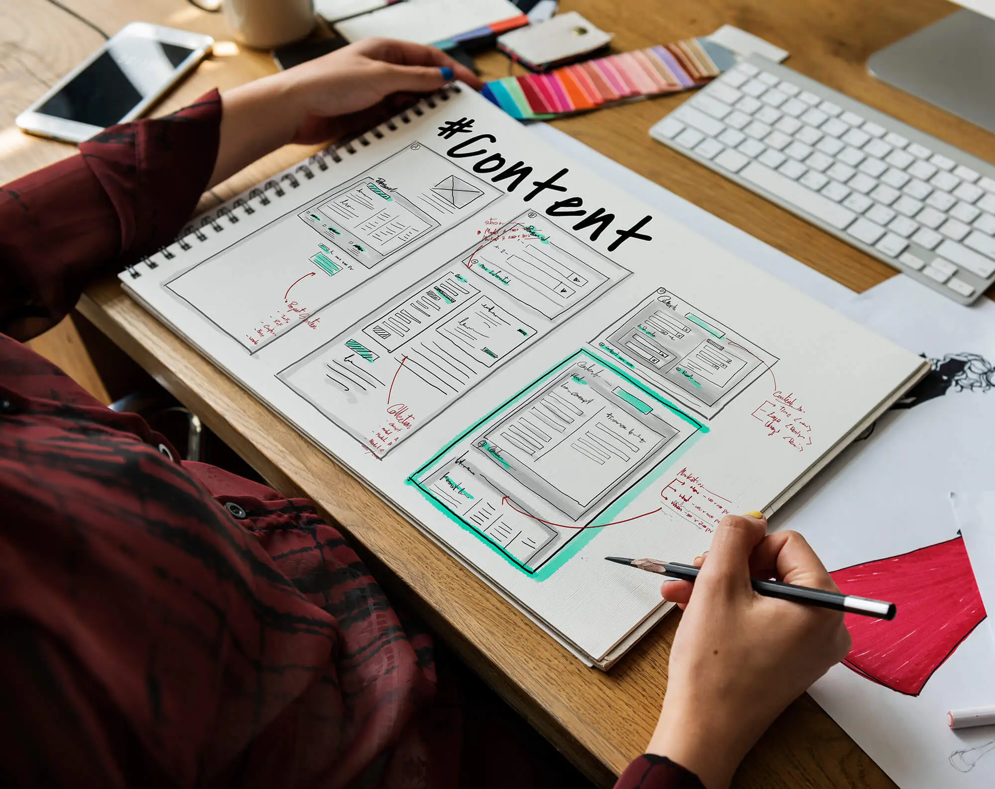
It really comes down to the visitor's relationship with your brand. The better they know you, the more a simple, focused design tends to win. The less they know you, the more reassurance they need first. We can't all be a household name, so think honestly about where your business sits — and, as with any good design, sketch the structure out before you build it.
Test, measure, then test again
If there's one habit that improves conversions more than any single tactic, it's testing. Don't be afraid to try things and get some wrong — you never really know what works for your audience until you try it.
A/B (or split) testing is the classic approach: you show one version of a page or element to some visitors and a different version to others, then measure which performs better against your goal. That goal might be newsletter sign-ups, account creations, purchases, downloads — whatever a conversion means to you. There are free tools to help you set experiments up, as well as paid platforms with more features.
The part people skip is the analysis. There's no point gathering data if you never look at it. Track your results, see which elements are pulling their weight and which need work, and ask your audience directly what they're looking for when you can. Traffic on your website is great; traffic that converts into real enquiries and sales is a whole lot better.
Conversion rate FAQs
Quick answers to the questions small business owners ask us most about lifting their conversions.
A conversion is any action you want a visitor to take. That might be buying a product, but it can also be filling out an enquiry form, calling you, booking a consultation, downloading a guide or signing up to your newsletter. Decide what a conversion means for your business before you try to improve it.
Put your main call to action where it's easy to find without scrolling, then repeat it naturally through the page — in buttons, within your content and near the end. Just don't overwhelm people with pop-ups and prompts everywhere, or they'll switch off and leave.
Yes. People are cautious about handing over money or details online. Reviews, an SSL certificate (the padlock in the browser), clear contact details, industry accreditations and real photos of your team all reduce hesitation and make it easier for someone to say yes.
Start by testing one change at a time. Try a clearer headline or a stronger call-to-action button, see whether enquiries improve, then move to the next thing. Small, measured tweaks beat a big redesign based on guesswork.